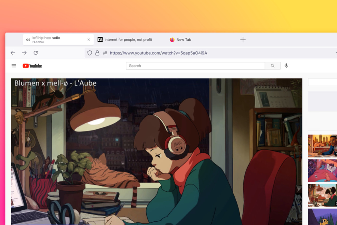
A screenshot of Firefox’s new floating tab design. | Image: Firefox
Mozilla launched a redesign for Firefox on Tuesday, and one of the changes you might notice first is a whole new look for tabs.
Firefox tabs are now bigger than they used to be, and the one that’s in focus will float above the toolbar near the top of the browser. In Chrome or Safari, by contrast, the tab that’s in focus looks like it is attached directly to the toolbar.
Here’s a screenshot I took to give you a better idea of what the new tabs look like.
And if you want an idea of just how much bigger the new tabs are in the new design, check out this screenshot a Verge staffer took comparing the new to the old.
Left: new Firefox. Right: old Firefox.
Mozilla says this new detached design was made to…


