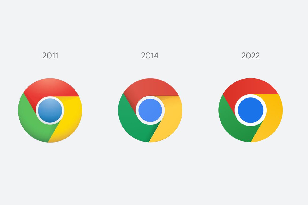
The new Chrome logo side-by-side with previous variations. | Image by Elvin Hu via Twitter
Chrome is changing its logo for the first time since 2014, and if you squint really hard, you might actually be able to see what’s different. Elvin Hu, a designer for Google Chrome, offers a first look at the logo’s redesign in a thread on Twitter, as well as some of the thinking behind the ever-so-subtle changes.
Some of you might have noticed a new icon in Chrome’s Canary update today. Yes! we’re refreshing Chrome’s brand icons for the first time in 8 years. The new icons will start to appear across your devices soon. pic.twitter.com/aaaRRzFLI1
— Elvin (@elvin_not_11) February 4, 2022
Instead of incorporating shadows on the borders between each color, essentially “raising” them off the screen, the red, yellow, and green are…


