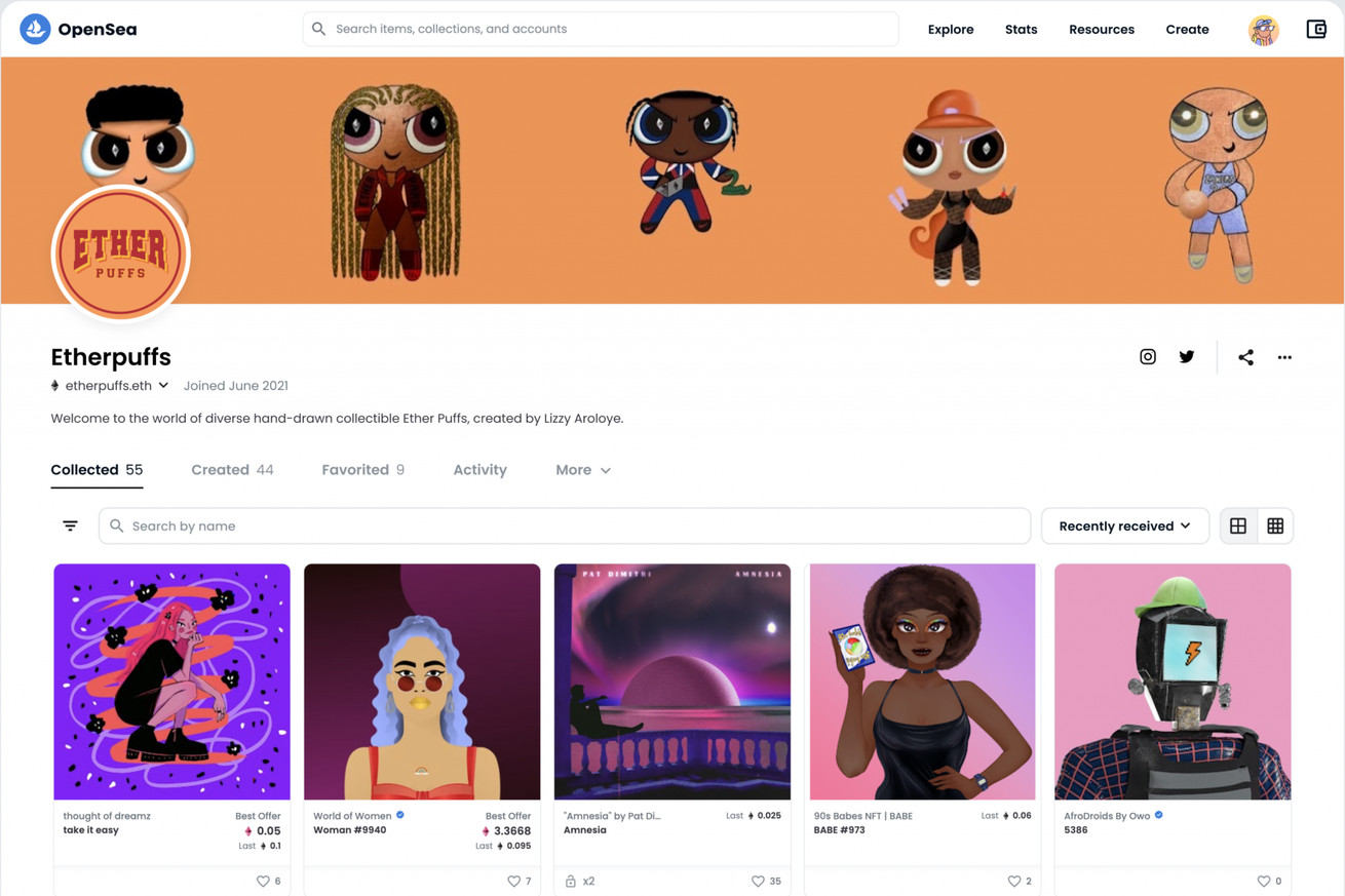
OpenSea’s new profile page. | Image: OpenSea
OpenSea, one of the largest NFT marketplaces, has redesigned its profile and collections pages with the goal of making the site easier to navigate and making the actual NFTs themselves the center of attention. In an announcement post on Thursday, the company says these redesigns are “just the start” of the company’s work to refine how its site works.
In my opinion, OpenSea’s refreshed profile pages look a bit like Twitter and Etsy’s. That’s not necessarily a bad thing, though. The old version could be a bit tricky to navigate at times, and it seems like the marketplace has smoothed out some of the edges.
The newly-designed Profile and Collection pages make it easier than ever to navigate OpenSea.
Our goal is to make it easier to…


