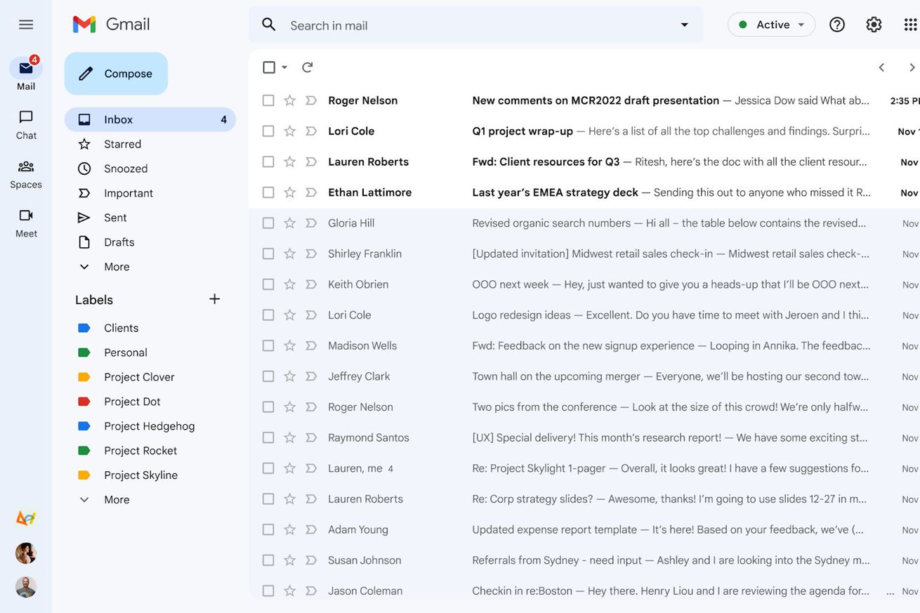
The new Gmail UI sets buttons for Gmail, Chat, Spaces, and Meet on one rail. | Image: Google
Google started rolling out an updated user interface for Gmail in February that pulls Meet, Chat, and Spaces closer and applies more of its Material You styling effects. Starting today, it’s becoming opt-out instead of opt-in, so your account will switch over to the new view by default pretty soon.
It’s not a huge change, but as Google transitions through its current flavor-of-the-week messaging app and weaves its Workspace suite into a better competitor for Office, this puts more of a focus on the updated experiences.
Image: Google
The old Gmail menu, with Chat and Meet aligned below your Gmail inboxes and labels.
If you can’t tell what’s different here, the updated UI collects buttons for Mail, Meet, Spaces,…


