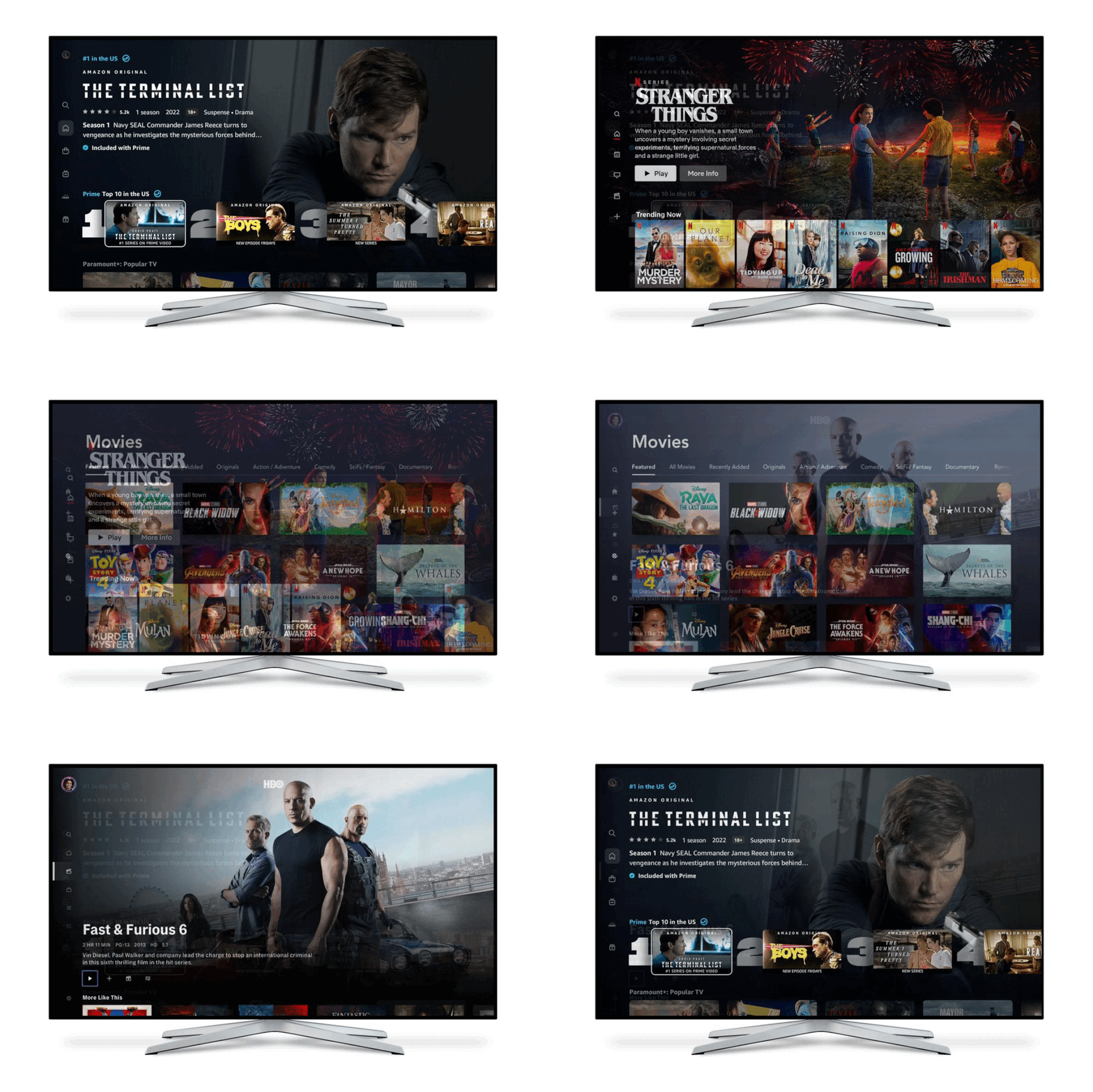
Images: Prime Video/Netflix/Disney/HBO, GIF: Chris Welch / The Verge
Earlier this week, Amazon announced a major redesign of Prime Video, and the overwhelming response was “finally.” Prime Video had become a relic frozen in time, with an ugly, laggy interface that seemed stuck in 2010. Amazon’s streaming competitors, meanwhile, have routinely switched up and refined the user experience.
And it seems like Prime Video’s designers noticed. Because another thing that stuck out about the app’s makeover is just how closely Amazon’s video service now resembles Netflix. Column of navigation icons on the left side? Check. Top 10 list with big numbers? Yep, it’s there on the home screen. And Prime Video has even added “super carousels” of poster-style artwork that expand to landscape and start auto-playing a…


