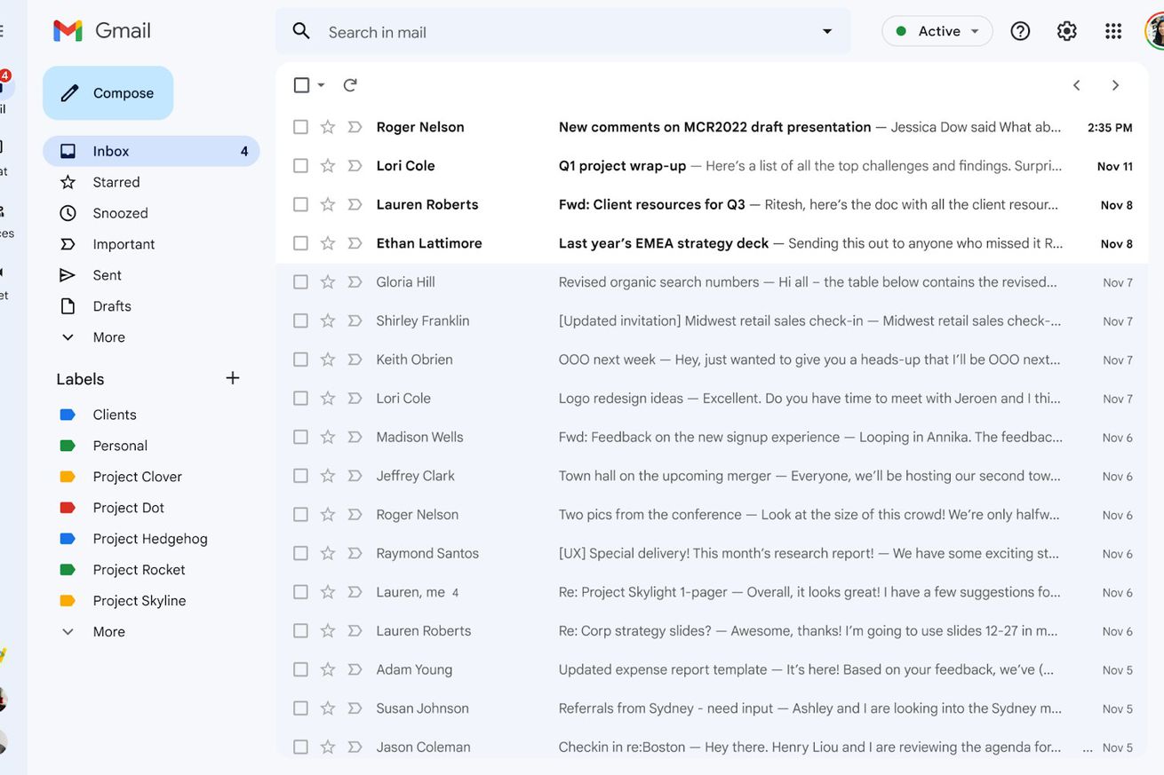
Gmail’s new look provides easy access to Gmail, Chat, Spaces, and Meet on one panel but can make the design appear cluttered. | Image: Google
Not a fan of Gmail’s new look for the web? I feel you. Even though the changes rolled out were small, that side panel featuring apps like Mail, Chat, Spaces, and Meet has cluttered things up, making checking emails first thing in the morning feel more overwhelming.
Sure, you can make things a little easier on the eye by hiding the Gmail category and label panel with some quick tweaks. But if you’re also not a fan of other changes, like the new light blue Compose button background that I found distracting, it’s actually pretty easy to revert to the previous interface. (Well, at the moment, at least. We’re not sure, after all, how much longer Gmail will let users revert to the old design — so let’s enjoy the luxury while we still can.)


