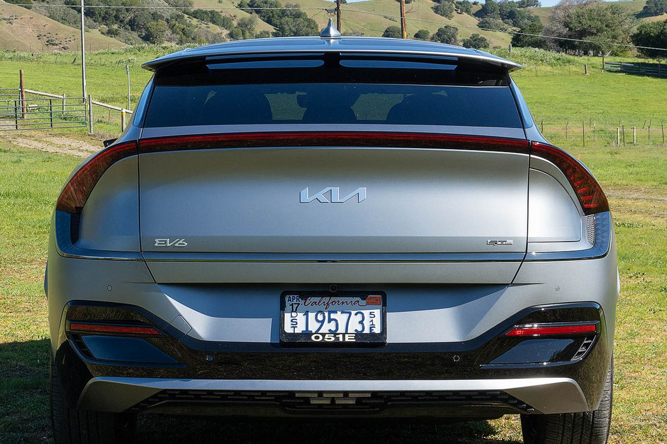
What do you see when you look at this logo? | Photo by Roberto Baldwin for The Verge
When I see the relatively new Kia logo, which is just the brand’s name but in an extremely angular, scrunched-up font with a seemingly connected “I” and middle line-less “A,” the first thing that comes to mind is “wow, that makes sense on a state-of-the-art EV but feels laughably out-of-place on this minivan.” But apparently, there are many, many people whose reaction is more along the lines of “wait… what does that say?”
Each month, there are around 30,000 web searches for “KN car,” according to data posted by ad agency owner Ashwinn Krishnaswamy on Twitter. The spike in searches — which seems to come from people trying to figure out if they’d missed the launch of an entirely new car company — started early last year, right around the…


