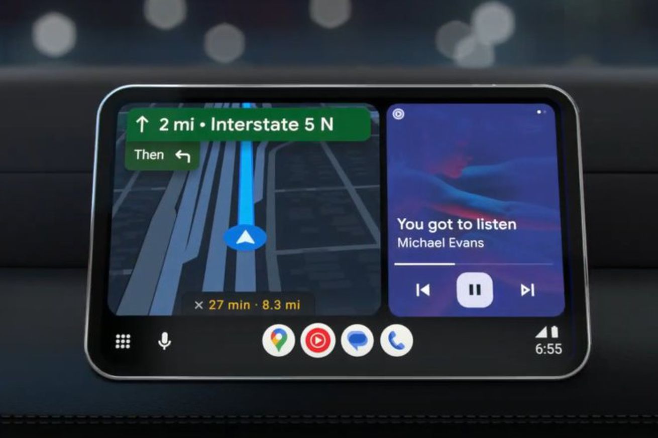
The new split-screen Android Auto UI. | Image: Google
The Android Auto look and feel has evolved greatly since we reviewed it in 2015, but now its biggest update is starting to roll out to all users, introducing a split-screen UI that can let you see more things at once. Keeping the map on screen while also adding one or two other panes makes it a bit more like Apple’s current approach to CarPlay, and Google says its focus is on creating a “more personal, easy-to-use experience from behind the wheel.”
Wherever the inspiration comes from, I appreciate it. Dubbed “Coolwalk” in testing over the last year or so, the new UI has been publicly available in beta form for several months after it was publicly announced in the spring, and as a longtime Android Auto user, I’ve had it in my car.
While…


