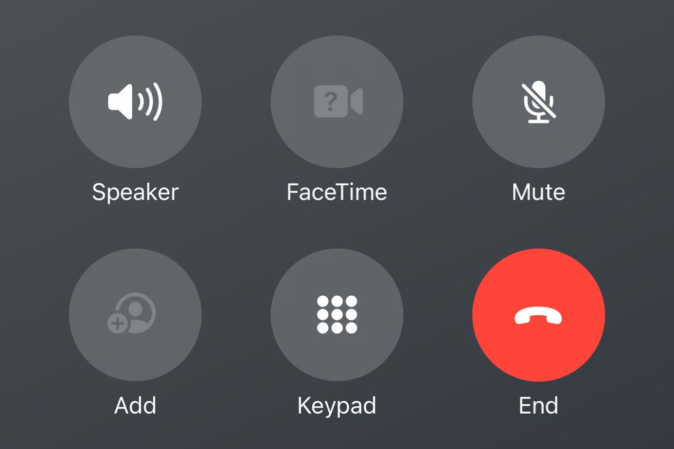
The end call button now sits much closer to the rest of the call controls. | Screenshot by Jess Weatherbed / The Verge
Apple looks set to be moving one of the most well-used buttons in iOS; the Phone app’s red end call button. Beta versions of iOS 17, which will likely get an official release this fall alongside the forthcoming iPhone 15, feature a redesigned call interface that shifts the red button down and to the right, and eliminates the distance between it and the rest of the call controls.
The new interface was technically made available with the very first developer beta of iOS 17, but it hadn’t been widely spotted until this week when the likes of CNBC and Gizmodo covered the change. Here’s a before and after comparison of the call interface between iOS 16 and beta iOS 17:
To me, it looks like Apple has made the change to account for iOS 17’s…


