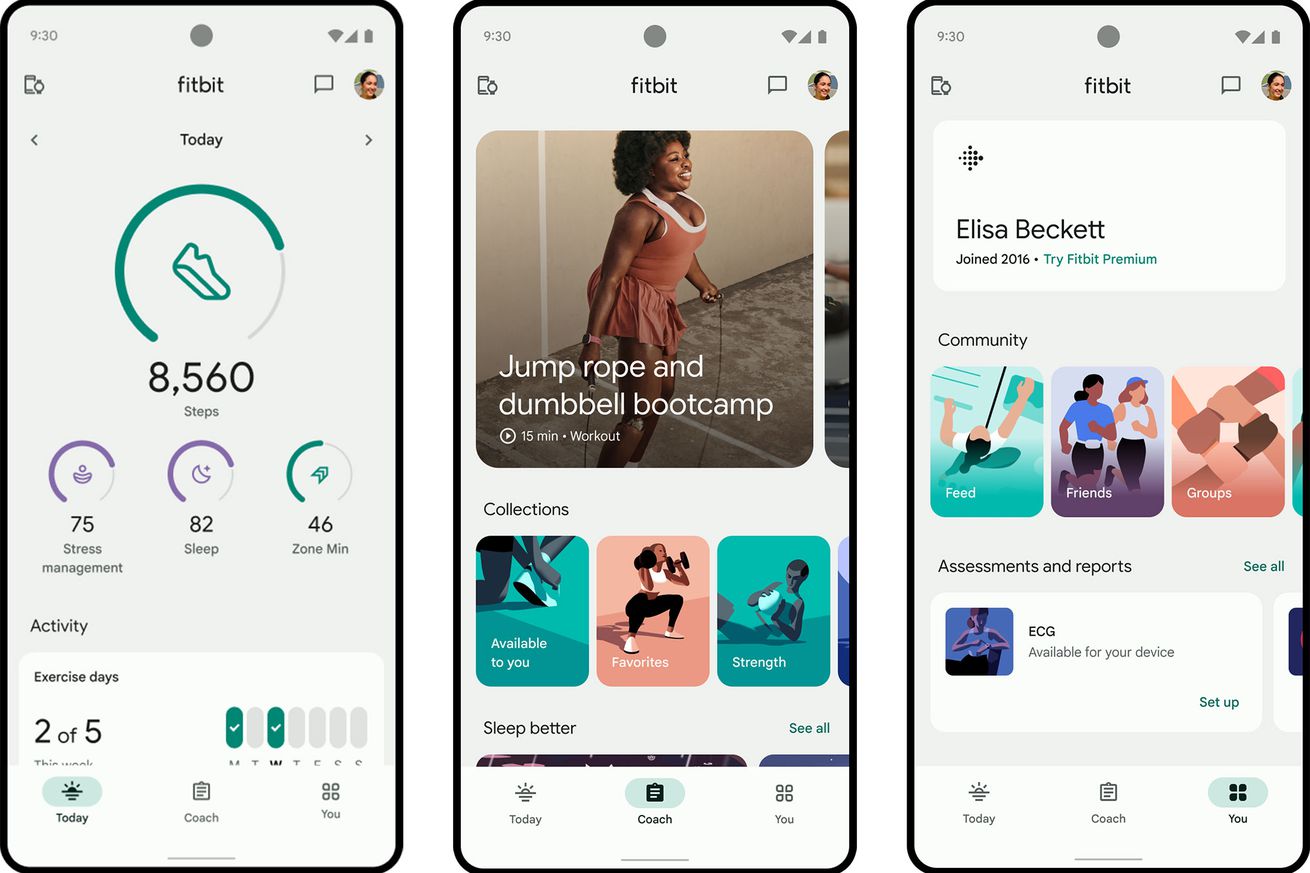
There’s a new three-tab structure and a more minimalist overall design. | Image: Google
Fitbit’s been going through a lot of changes over the past year — and it looks like that’s only going to continue. The Google-owned app is getting a total redesign this fall, and select Fitbit users may see an invite to try a beta version starting today.
For starters, Fitbit is reorganizing how it presents your data. Going forward, the app will be divided into three tabs: Today, Coach, and You. The Today tab isn’t changing too drastically from what it is now, but the main metrics you see up top can be customized to highlight different focus areas. For example, if you want to sleep better, you’ll see your Sleep, steps, mindfulness, and Zone Minutes first thing. If your goal is to improve your heart health, the app will instead emphasize…


