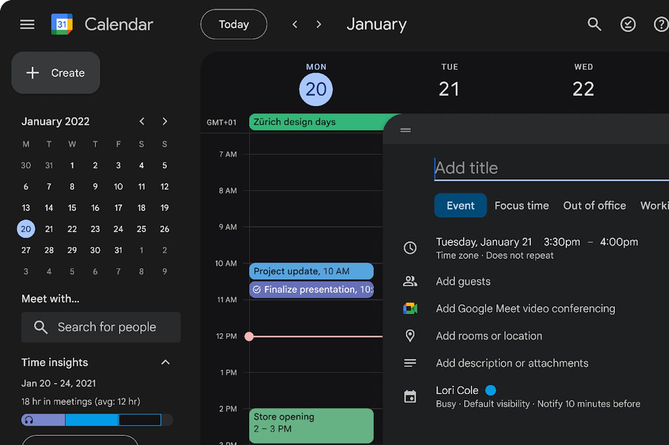
Google Calendar on the web’s new dark mode started rolling out to users on October 23rd. | Image: Google
Google is finally introducing a dark mode to the web version of Google Calendar and rolling out a “refreshed user interface.” The new UI will include buttons, dialog boxes, and sidebars that are “more modern and accessible” with improved typefaces.
The update started rolling out this week and soon it will be available to everyone, whether they’re using a personal Gmail login or any sort of paid Google Workspace account.
Once it’s available on your account, you can turn on the dark mode by clicking the settings icon in the top right corner of the Google Calendar interface, which presents a new drop-down menu with the dark option available under “Appearance.” Users can also switch back to the light option or choose to match their…


