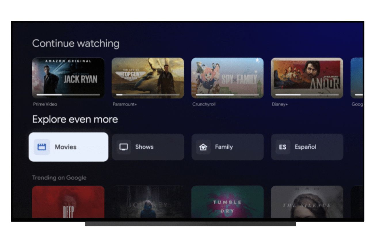
Image: Google
When it comes to browsing entertainment, is there really a big difference between organizing content in different tabs or splitting it into totally separate pages? Google seems to think so. Today, the company is announcing some tweaks to the Google TV interface. “Movies” and “Shows” are being dropped from the main navigation bar at the top and will now be found beneath the row of your favorite streaming apps in the “For You” tab.
In that spot, they’ll be joined by two new sections: Family and Español. Both are pretty self-explanatory. “With content ratings of PG or lower, it’s easy to find something the whole family can watch together,” Google says of the family page. (Kids will still be able to have their own profiles that are limited…


